How to Use ForecastFlow
A guide to understanding your project forecasts.
Probabilistic Forecasting
Traditional project management often relies on "gut feel" or single-point estimates that rarely account for reality. ForecastFlow uses Monte Carlo simulations to provide a range of possible outcomes based on your team's actual historical performance, helping you move from guessing to predictable delivery.
1Azure DevOps
Connect securely using a Personal Access Token (PAT). We'll automatically calculate your throughput from your completed work items.
2Linear
Use your Personal API Key to sync your Linear teams. We'll analyze your cycle time data to generate throughput patterns.
3Manual CSV
Upload a simple CSV with a single column of numbers representing items completed per day (including zeros for weekends).
Example Throughput Data:
items_completed
2, 0, 3, 1, 1, 0, 4, ...
Each number represents the total items completed in one day. A good dataset has at least 20-30 data points.
Don't have permissions to generate an API key? Use these guides to extract your data manually:
Instead of simple math, we run 10,000 simulations of your project. In each simulation, the engine "samples" from your actual historical throughput to play out a possible future for every single day of the project.
Why 10,000?
Running thousands of simulations creates a probabilistic outcome. It captures the "messiness" of real-world development—the slow weeks and the ultra-productive ones—allowing us to generate confidence intervals (e.g., "85% likely to finish by Oct 1st").
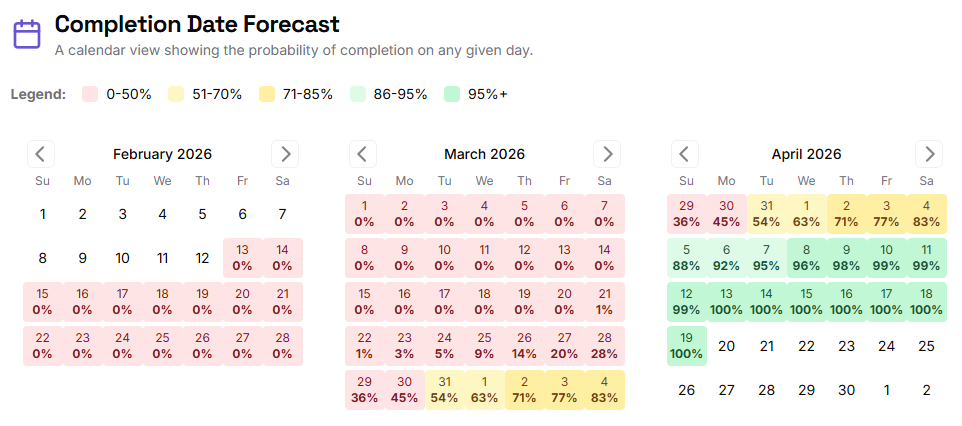
Completion Date Forecast
This calendar view shows the cumulative probability of finishing your fixed scope by any given day. Darker greens indicate higher certainty. An 85% or 95% confidence level is recommended for high-stakes planning.
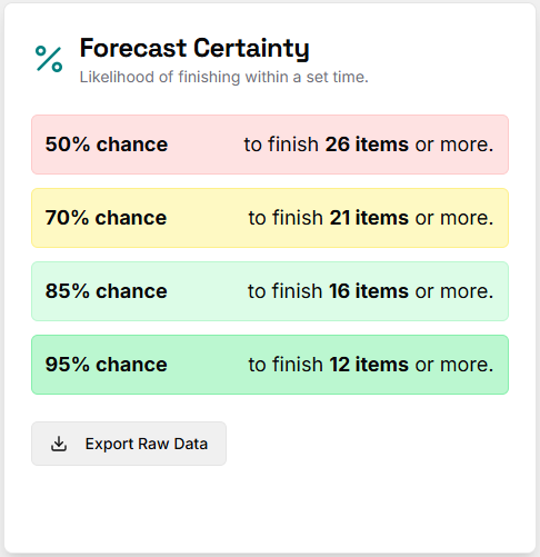
Scope Forecast (Confidence Levels)
When you have a fixed deadline, this chart tells you how much you can likely get done. It provides a clear breakdown of "High Confidence" vs. "Most Likely" outcomes, allowing product teams to manage stakeholder expectations effectively.
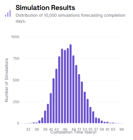
Simulation Histogram
This "bell curve" visualizes the distribution of all 10,000 simulations. The peak shows the most frequent outcomes, while the "tails" represent best and worst-case scenarios. A narrow curve indicates high predictability, while a wide curve suggests high variability in your team's process.